About two years ago, digital marketers began talking about the ?mobile revolution? and how it was going to change the Web forever. There?s been a lot of buzz about the Internet getting predominantly mobile by 2014.
However, this simplistic view of the global Internet?s future (which didn?t answer many of marketers? questions) soon got replaced by a more informed opinion, which involves understanding how the searcher uses different types of devices for various purposes.
Nowadays, it?s not mobile vs. desktop any longer. We are now talking about multi-screen user experience (some solid data in this post, by the way), during which the searcher transcends different types of gadgets and different screens to complete one goal. Conclusion: In practice, mobile experience is not opposed to desktop experience, but compliments it.
Do you need a mobile strategy?
Despite all the mobile revolution talk, only 21 percent of websites are optimized for mobile. Sometimes site owners don?t realize the immense opportunities additional mobile traffic represents. In other cases online marketers believe there?s little target mobile audience for them because of their niche.
Usually, the moment of truth comes when a site owner looks at how many mobile users actually search for their industry term/s, which is easy to check with Google?s AdWords Keyword Tool by playing with Advanced Options and Filters:
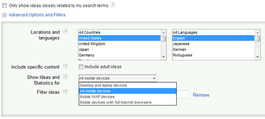
And, you could check your Google Analytics statistics to see how much mobile traffic your site gets and what the bounce rates are.
Another test one could perform is to grab a handheld device (or better several of them) and see what their site looks like on, say, an iPhone. BTW, don?t gasp in awe if you see your homepage get auto-resized to fit a smaller screen?this alone doesn?t make your site mobile-ready.
What does make it mobile-friendly, though, is bigger text, cleaner layout, easy-to-click buttons (no tiny text links!), and other mobile usability wonders.
Now, as Google?s survey reveals, 61 percent of searchers say that, if they didn?t find what they were looking for on a mobile site, they?d quickly go some place else.
So, if your site requires the user to manually enlarge content or scroll, it?s probably time you think about making it more mobile-friendly to attract more visitors.
I think there are five major approaches to develop mobile presence, and you should decide what approach to use based on the size and the type of your business and the resources you can allocate for a mobile campaign.
I describe these approaches, including their pros and cons, in detail on my blog, so here?s just a list of them:
- A mobile site
- Responsive Web design
- A mobile app
- Local + Social
- Offer-oriented mobile Web presence
Do mobile users search a lot?
Another important point I?d like to make is that, not only should one create mobile presence for their brand, but also optimize their mobile site/offer for the search engines. Why? Because, according to Google, 63 percent of users actually use search to locate a business from their handheld devices.
Hence, it?s not enough to simply create a mobile page or a local webpage. It should have backlinks, shares, and mentions, and contain your keywords to occupy leading positions in the SERPs. Only then will your mobile Web campaign bring decent fruit.
How other brands do it?
Of course, most big brands nowadays are represented on the mobile Web, with smaller businesses getting there as well. And, quite often, a brand uses not just one, but multiple ways of reaching mobile users via a site, an app, an offer, etc. Here are some good examples:
1. Starbucks
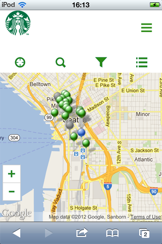
Starbucks offers several solutions for mobile users. First, a nice responsive design site is available to the iPhone folks:
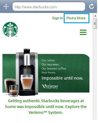
Can you see the ?Find a Store? button? Very thoughtful of Starbucks, since most people would just probably be looking for a nearby store.
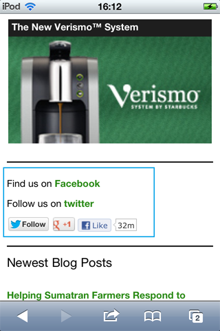
Second, Starbucks offers an Android and an iPhone app that let one use their Starbucks points, buy gifts, browse Starbucks locations, and more.
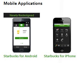
Besides, if you don?t have the app, Starbucks has a really cool store locator tool which renders just fine on an iPhone (thanks to RWD):
2. Walmart
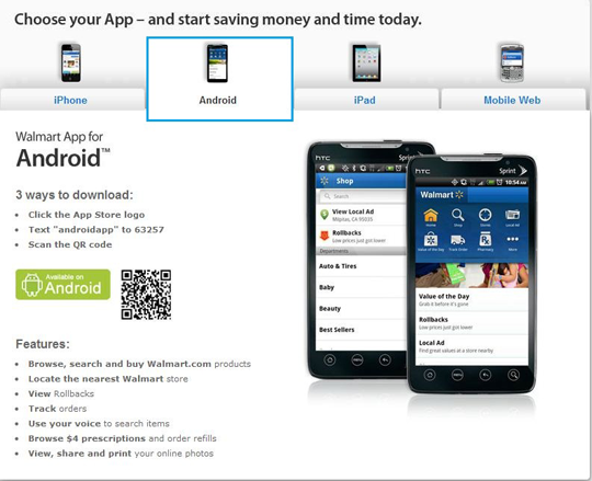
Now, Walmart are pretty serious about its mobile Internet presence. Not only do they have a mobile website, mobile.walmart.com, but also offer a variety of mobile apps to choose from:
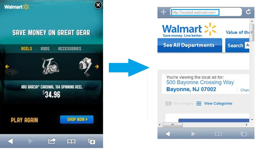
Walmart also once did an interesting mobile promo campaign that got mixed reviews. The company created a mobile game, the point of which was to catch a fish to unlock Walmart?s fishing gear products.
Shoppers were expected to click on a product and land on the Local Ads page Walmart was promoting with the campaign. However, as the campaign?s critics pointed out, the destination page was not optimized for mobile, which was a failure on behalf of the retailer giant.
3. Cuckoo?s Nest
Finally, I?d like to provide an example of a small local business that?s quite well represented on the mobile Web, even though it doesn?t even have a website.
I?m talking about the Irish pub called Cuckoo?s Nest in Queens, NY. The pub has no website, but is listed on a whole lot of other Web resources that are pretty mobile-friendly: Google+ Local, Yelp, Foursquare, Facebook, etc.
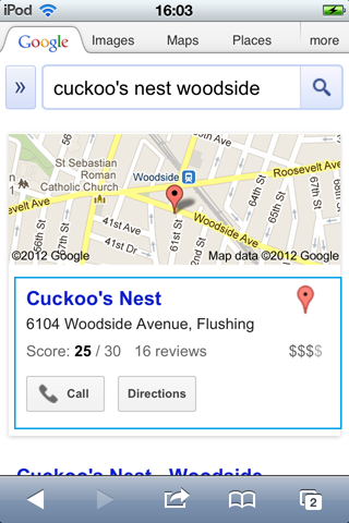
And, as you see, it shows up for its name in the mobile SERPs, with its Google Local listing occupying all of the screen?s real estate.
Conclusion
With the holiday season underway, it?s time for online businesses to explore additional sales opportunities, many of which can be found in mobile Web marketing.
There are many approaches to promoting a biz to mobile users that fit different budgets, from developing a mobile app, to building a mobile site, to using QR codes to get people to follow you on Twitter, etc. Whatever method you choose, don?t miss your chance this Q4!
coolio daylight savings time 2012 ricky rubio day light savings time peter paul and mary edgar rice burroughs dallas clark
No comments:
Post a Comment
Note: Only a member of this blog may post a comment.